Buttons draw the user’s attention to trigger actions and links.
Button Set
Do use one to three buttons at a time. This will avoid overwhelming a user with buttons, and will help to narrow down choices.
Keep button label reasonable. Try to keep button labels to one to three words. Overly long buttons can look awkward. If a button has long text, try pairing the button with a heading to break it up.
Use meaningful language that tells users what to expect. Make sure the user knows where they will go when they click a button. Avoid generic language such as “More,” “Click Here,” or “Submit.”
Don’t overuse buttons. Prioritize the actions you want your users to take. Avoid using row of over three buttons, as well as “sprinkling” too many buttons throughout a page.

Example
WordPress Block Editor
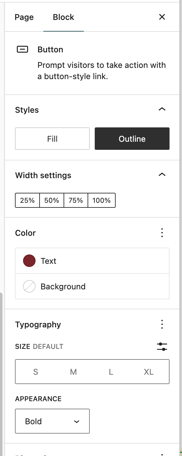
WordPress button blocks do not use the theme’s style without manual modification.
Horizontal
Vertical
With Some Modifications

With some modifications to the block settings you can mimic the look of the button. But the style transitions won’t apply to them.
Example
Theme Specific Editor Blocks
-
Accordion
-
Blockquote
-
Button Set
-
Call to Action: Large
-
Call to Action: Small
-
Card Set
-
Carousel
-
External News Story
-
Feature Set
-
Feature with Large Image
-
Feature with Large Image And Intro
-
Feature With Small Image
-
Full Width Image
-
Home Hero
-
Image Grid with Text
-
Link Block
-
Link Set
-
Multi Column Content
-
Page Hero
-
Rich Text/WYSIWYG
-
Statistics
-
Table
-
Video Embed
